We already know that R can handle a multitude of tasks, including data graphics, data wrangling, transformation, simulation, statistical analysis, and modeling.
But did you know that you can also use R to:
Create TikTok animations Solve everyday mysteries - like exploring NYC metro traffic Develop a “hit” game Address NLP problems with deep learning models Automate work processes If you’re interested in learning more, check out my talk for students at Weill Medical College of Cornell University.
Join Rachael Dempsey and me for the RStudio Data Science Hangout next week (Thursday September 1st) @ 12pm EST! We will talk about managing R projects at work, building Data Science Career, and whatever else you want to discuss 😀. Hangout link
Check out the recording on youtube.
I’m excited to share that I will be speaking at rstudio::conf(2022) on July 27 about Saving 1,000 hours with RStudio: selling R in your workplace.
Several years ago, I initiated a work automation project using R at CARFAX that aimed at saving 1,000 hours per year and has now saved over 12,000 hours.
In this talk, I will share the key parts of the project, lessons learned, and a structure you can follow if you would like to do something similar in your organization.
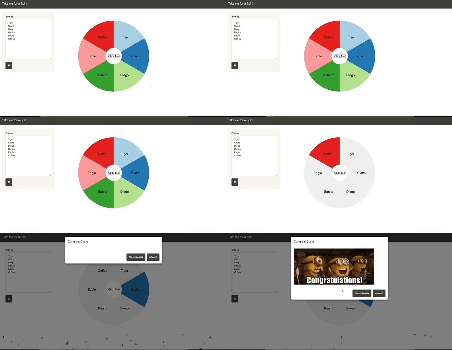
Having thought about creating a wheel of fortune type of shinyapp for some time and finally got enough motivation to give it a try. Below is what I got. You can put the choices on the wheel and give it a spin here and the code here
Motivation A few weeks back, my wife’s cousin visited us, and we talked about different team-building activities. One idea jumped out to me that it prepared general ice-breaker questions for whoever got picked from a wheel of fortune app.
This may feel like wordle for numbers but it is called Bulls and Cows. This is a game I played 20 years ago on a black and white LCD screen that looks like the one below. Give it a try and see if you could get on the leaderboard here.
Background In the early 2000s, my cousin showed me this game on his digital dictionary, which was a thing back then.
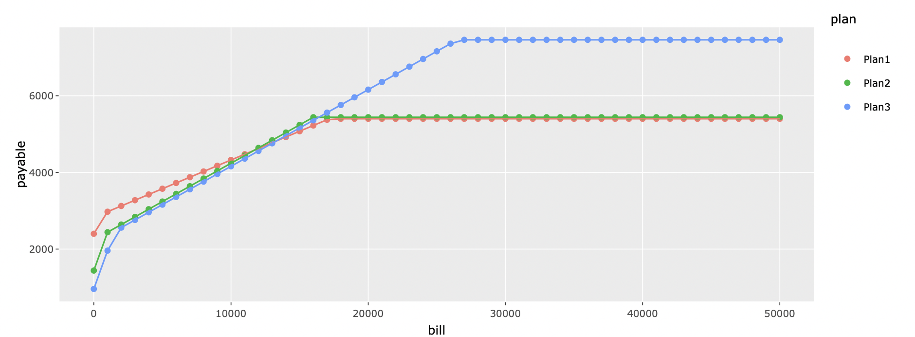
Background As someone new to the whole healthcare system, I often do not know which healthcare options to go with when it involves HSA/FSA, deductible, copay, company matches, etc. In the attempt to find the best choice for the healthcare plan, I spent a few hours creating a shiny app for everyone to modify for their own purposes. You can find the app here and the code here
How I used this The app will ask you to put in the specific information for different plans you have, including deductible, out of pocket max, premiums each month, coinsurance and if you use HSA, and company’s match on HSA.


